BRANDING - RAWK MANAGEMENT
LIVE MUSIC — TO GO
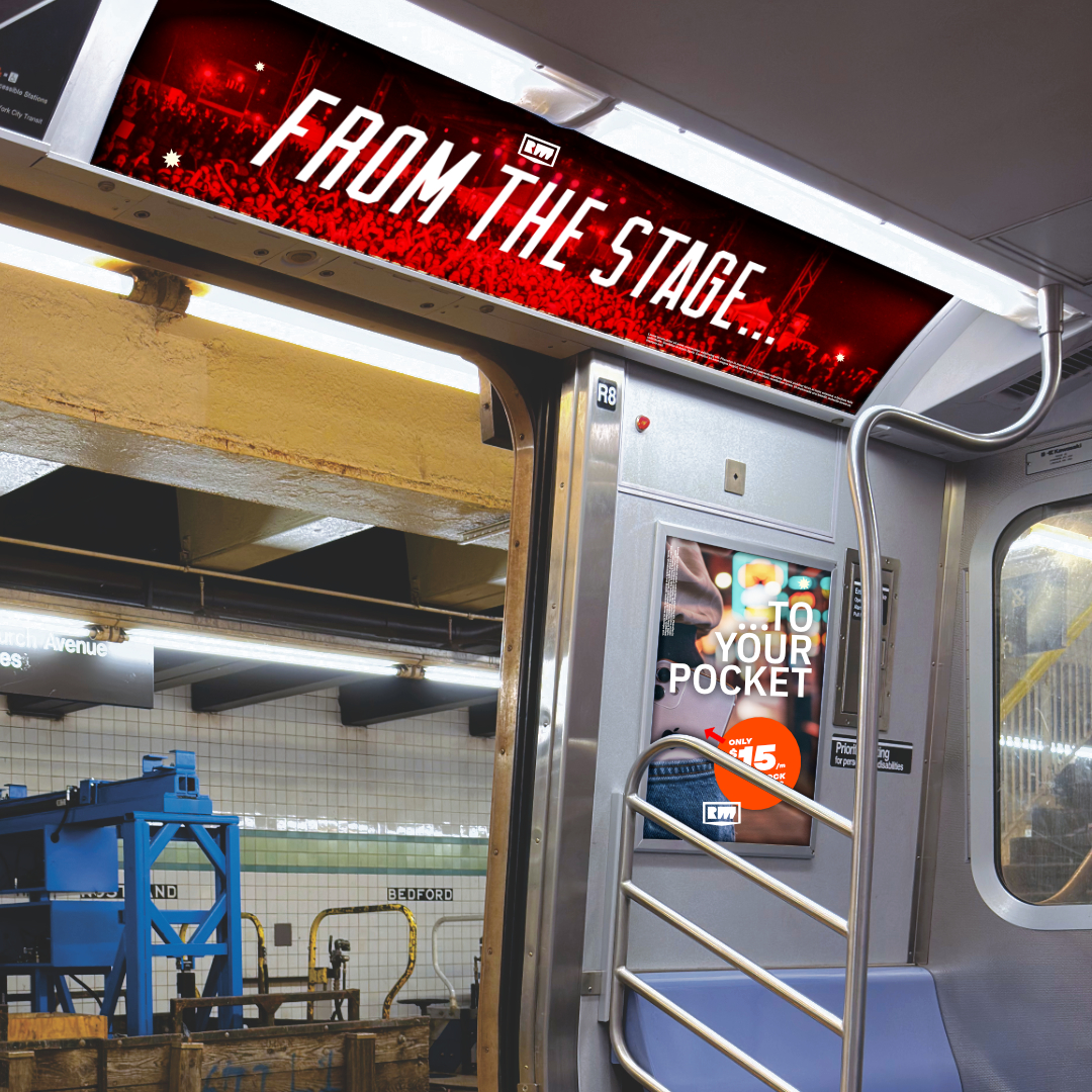
Rawk Management is a music platform that supports independent artists by transposing their live recordings to high bit rate lossless streaming media. The company's goals were originally slightly different, in just management. But as the internet has become a much more accessible, the focus of the group changed to supply further support of upcoming local musical talent. The design flows from simplicity of stage performances into the pocket of the fans. The design mimics a stage presentation with the rectangular casing around the diamond / arrow stage.
BRANDING - SUPERNOVA
LET'S GET LOUD
A graphical flip that plays on their original logo. Supernova was the staple in local live shows in Toronto for decades. Young bands looked to them to get promoted on a larger scale. This makeover keeps the heritage, and pipes it up as an animated atomic cluster.

BRANDING - THE SPEAKEASY
LOOKING THROUGH THE PEEPHOLE
The Speakeasy Toronto is a club based on the prohibition years in North America. The logo adds mystery as to what's on the other side of the door? Parties! That's what!

BRANDING - VNATION
CYCLICAL TEAMWORK
VNation came about as podium for up and coming vector artists around the globe. The logo represents everyone and everything encapsulating the scene from all parts unknown. It was a successful venture in the early days of deviant-art.

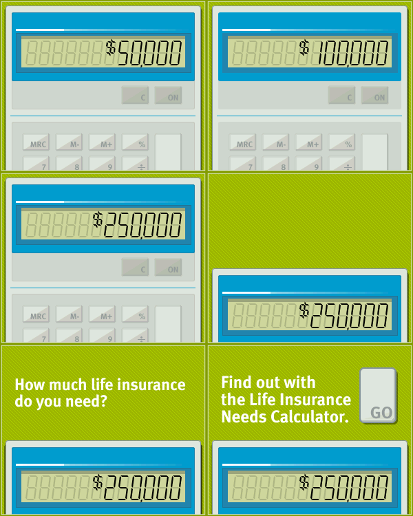
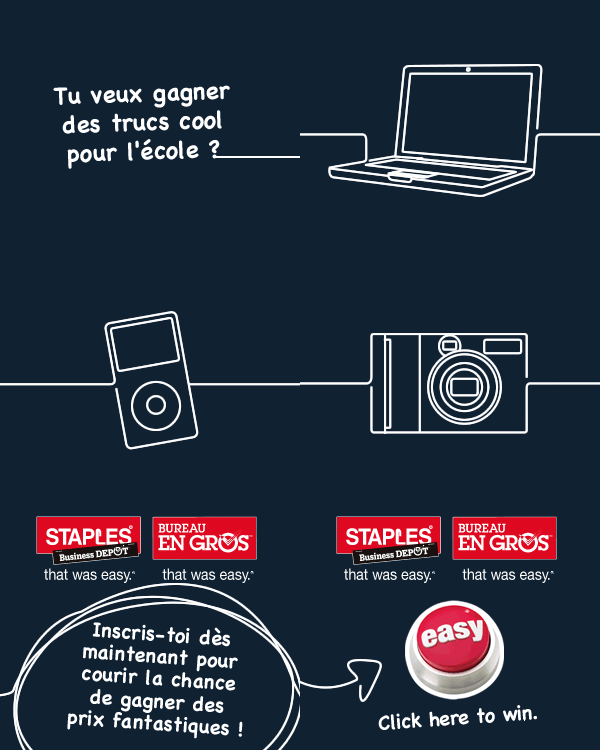
ADS - VARIOUS BOX ADS
MOUSE OVER
It's been a while since working on these graphics. Must have done thousands of these over the years. These are 3 that I art-directed to successful Canada wide usage via Microsoft, RBC, and Staples Canada.

BRANDING - VARIOUS LOGOS
WORKING TITLE
It's been a while since working on these graphics. But I think they're still very relevant because of how the internet still works.
- 1 - OPEN AIR - Indie Dance collective
- 2 - IDAC - Collective of independent modern dancers coming together to create a more powerful entity
- 3 - Arms 2 Arts - Bullet style inset graphic based on pressing machines in WW2
 2
2
